Thursday, September 29, 2016

Snowy in Aqua

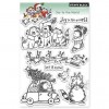
 Today I wasn't sure I would make any cards.  Instead I thought I might just sort and organize but then I saw the Penny Black "Snowy" stamp on my desk.  That got my creative juices going and this is the card I ended up with.


Maybe it is his smile that is contagious... I just love bringing this little fellow to life with my copic markers.  The color theme I used for him today was inspired by some of the patterned paper in my stash from last years Christmas card making.  I am sorry, but I am not sure of  the company.
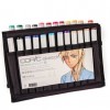
These are the colors of  Copics that I used.

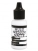
The sentiment is also from Penny Black. To add the snow, I simply apply "Rangers Multi Medium Matte" to the image where I want snow then while it is still wet I sprinkle on a clear micro glitter.  When it is dry it stays put.

Thanks for dropping by my blog.  Your comments, questions and suggestions are always most welcome.


Supplies:


Monday, September 26, 2016

Mo Manning Digi Christmas Cards

One of my favorite artist to use for making cards is Mo Manning.  She sells her art work in a digital format at Mo's Digital Pencil.  You might also recognize her work from the rubber stamps that she has created for Penny Black.   I love her work and own it in both forms.  
This cute digital file is called "Seasons Greetings 2016".   I was able to use my inkjet printer to print the image onto watercolor paper.  I could have probably used a plain cardstock instead but I wasn't sure whether or not I would use watercolors.  Actually, I found that watercolor is not the best choice as the inkjet ink tends to bleed a little with water.   I used Copic Markers for the coloring of the card above.


This is the second card done with the watercolor.  As you can see, there was a different result.  It is not terrible but not as good as my first card.   No, I do not own stitched dies in these shapes.  I used the dies I do own in some creative ways to make the frames for my images.


Who doesn't love a Christmas snowman?  This is one of my favorites from Mo Manning called appropriately enough "Snowman" .   I used the same printer for this one with layering weight plain white cardstock which feeds through the printer very easily.  I colored my image with Copic Marker for this one as well.  To add the glitter snow, I simply applied a bit of Ranger Multi Medium Matte and while it was still wet sprinkled it with a clear glitter.
For a finishing touch, I couldn't resist adding a few sequins from my stash.

Thanks for checking out my cards.  I hope they provide some inspiration.  Your comments, questions or suggestions are always welcome.

Supplies:


Thursday, September 22, 2016

Incredibly Grateful

Today is the first official day of Autumn and a great time to pull out the watercolors to create a fall card.  I chose this stamp set from Simon Says Stamp to make a pretty background of fall leaves.   I used my MISTI to make a leafy border around the sentiment from the set.   Each leaf and the sentiment was inked with Hero Arts "Artprint Brown" and embossed with clear embossing powder.   The fun part was adding the fall colors with a variety of watercolors in the background and on the leaves.   To finish it off with a bit of shimmer I added a spray of Heidi Swapp "Color Shine Gold."

I am entering this card in two challenges.  The current challenge with the SSS Flickr Group HERE , and also Paru's Card Making Challenges "Focus on the Words"

Thank you for checking out my blog.   Your comments, questions and suggestions are always welcome.


Supplies:


Monday, September 12, 2016

12 tags of 2016 / September


This month's inspiration tag from Tim was taken from his Chemistry 103 class and my favorite technique of the whole class.  It seems almost magical when you see the negative image appear from beneath the stamped image.  


The two remix techniques used this month were "Distress Patina and Alcohol Ink Resist".  For all the how to details check out Tim's blog,  Here

I used the butterfly for my main image.  This butterfly has a lot of wonderful detail that became a bit more washed out that I liked, so I decided to overstamp it again with the Archival Ink to bring back some of the sharp details.  In the end it still has the negative effect and I was happier with this version.

Hope you will give this alcohol ink and resist technique a try.  The Yupo paper makes such a huge difference and is worth the investment for working with the alcohol inks.  I don't have a large selection of colors.  For this particular technique I definitely think that a darker color works the best.  I have the Pitch Black and Mushroom inks that Tim used on order, but couldn't wait to give this month's tag a go.   The colors I used were Eggplant and Cloudy Blue.

I recently made a greeting card using this same 
alcohol ink resist method.  If you are interested in the details and supply list you can check it out HERE  


Thank you for dropping in.  Your comments, questions and suggestions are always welcome.


Supplies: